Vendo connects artisans with buyers, offering a community-focused platform for selling handmade products year-round.
Overview
THE PROBLEM
Local artisans face significant barriers in reaching customers year-round, often relying on seasonal markets with high fees and limited availability. These challenges are compounded by the lack of a dedicated online platform that caters specifically to their needs, leading to inconsistent sales and the risk of business closure.
THE SOLUTION
Develop a community-focused marketplace that empowers local artisans to sell their handmade products year-round with intuitive tools and increased visibility.
PROJECT DURATION
6 weeks
MY ROLE
Researcher, UX Designer
SKILLS
SKILLS
User research, Synthesizing Research, Affinity Mapping, Information Architecture, Wireframing, Branding, Prototyping, Usabilty Studies
Discovery Phase
COMPETITOR ANALYSIS
Local marketplaces for handmade and crafted goods reveal potential for fostering community but often lack focus on regional artisanship.
I conducted a competitive analysis to explore how existing platforms support local sellers and buyers, with an emphasis on their features, strengths, and weaknesses. This analysis uncovered key areas for differentiation and opportunities to create a more localized and community-driven marketplace experience.
PRIMARY & SECONDARY RESEARCH
The goal of my research is to understand the needs, preferences, and pain points of both local vendors and potential buyers to design a user-centric online marketplace.
I conducted four interviews, counting me as a user, I did an auto-etnography as someone who wanted to open a business of multifunctional scarfs and tried to sell in physical markets but at the end it wasn’t worth it. I also did a netnography on online blogs on the following topics: Where Do Artisans Sell Crafts in Vancouver?, Selling Art & Crafts Local Craft Fairs That Don't Cost Vendors the World, How to Sell My Handmade Items to Local Brick, Where Do You Sell Besides Etsy?
I then I put together all the research main points and created an Affinity Map. This was a very interesting exercise since its a way to graphically see everything and while categorizing in clusters I can gain a better understanding of the problems my user is facing.
ACTIONABLE INSIGHTS
After the monumental task of uncovering my findings and figuring out the inner workings of my user’s mind, it’s time to turn those findings into insights. Insights can then be translated into solutions for specific user problems.
Here are some actionable insights that might give the direction of the next steps in my product development process.
THE WHO
USER PERSONA
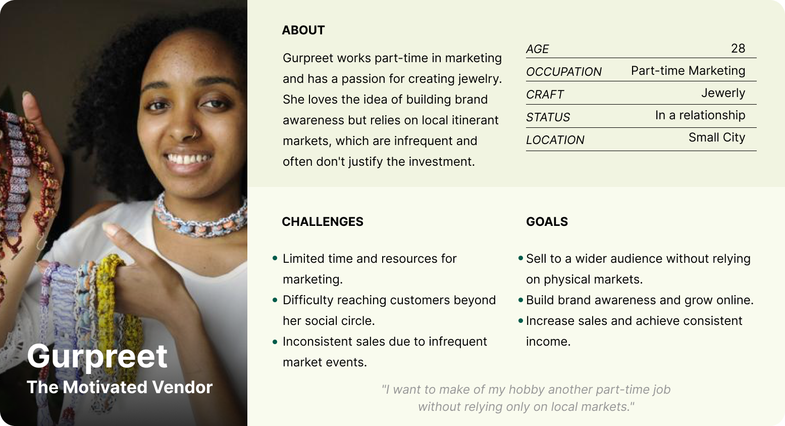
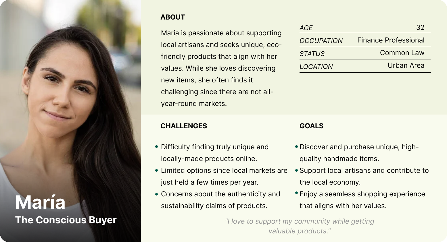
I created 2 personas based on my interviews and research. First we have the motivated vendor that only do it as a hobby, they usually have another job but the idea of making extra money is very exciting. And on the other hand we have the conscious buyer, who is looking to support the community by supporting small businesses over large corporations. These two personas are the main users that Vendo will be designed for.
DEFINE
HOW MIGHT WE 🤔
To frame better my user research insights, I used the HMW method, where the questions are created from the user’s point of view and designed to break down the POV into more manageable pieces, making my research more digestible.
USER FLOW
Mapping out the actions a user can take on the website
Before creating the product, I drew out the user flow to make sure that users are able to finish their tasks without any unnecessary steps. In the begining of the flow, it breaks intwo two different flows, thats where the Vendor and the Buyer journeys divide.
For better clarity, you can check the User Flow on Figma in this link.
Design
WIREFRAMING
Sketching out the wireframes from task flows
Here we have sketches of several pages from the Home Screen, Vendors, Vendor Profiles and Check Out Process to the Big Picture Overview of the Vendor Dashboard. Since it is a responsive website, I will adapt it in the future to design the layout on the Mobile Version.
BRANDING
Visual Identity
VENDO is a spanish word that means “I sell” and it is a very common word in the local markets world where everybody reach your stand and ask “Que vendes? (What do you sell?)” and the crafters would reply “Yo vendo XYZ. (I sell XYZ.)”
The icon is an absraction of the famous existing abstraction of the two hands closing a deal making the shape of a heart. Also the shape of the icon is like the letter V.
PROTOTYPING
LOW AND HIGH FIDELITY PROTOTYPE
It was time to digitalize the wireframes, I created some Low Fidelity Prototypes where I gaigned a best idea of how the structure of the product will be.
To ensure the designs meet the needs of our users and our research goals, a clickable prototype was designed for 2 flows:
Navigate the home and vendor pages, selecting a vendor store and buying a product.
Loging in as a Vendor and seting up the online store in the Vendor Dashboard.
Usability Studies
USER TESTING
Moderated 1:1 Usability Studies
The prototype was ready to test, I’ve created a small usability testing plan and have specified that I conducted 1:1 moderated usability study to collect user testing data. Knowing the method of testing I also generated a usability testing interview question list to guide my studies.
USER TESTING
Results
I had a mix of positive and constructive feedback from 3 participants. The moderated usability study was made both online and in person. Here are some of the main insights that I recover from the studies.
I marked with ⚠️ the most urgent actionable insights to work on.
I marked with ⚠️ the most urgent actionable insights to work on.
🔎 Click image to enlarge
Final Designs
FINAL PROTOTYPE
The final prototype consists in two different flows.
Buyer Flow→ Exploring the Homescreen → Checking out the Ceramic Category products → Checking out the Vendors → Visit a Vendor Store → Adding a product to the Shopping Bag → Checking Out → Chosing delivery method → Adding card details
Buyers are able to view the vendor profiles and learn more about them to really connect with them. Buyers can conveniently filter the products and vendors by location or by category. When they find the desired product they are able to select the type and time of the delivery.
Vendor Flow → Exploring the Homescreen → Loging into account → Dashboard View → Setting up the Vendor Store
Vendors are able to have access to an intuitive dashbiard where they can manage their orders, their revenew their shipment and payment methods and more. No more excel docs or google sheets, Vendo Dashboard is what you need if you are a vendor. Vendors can create their profile in a way they can connect with their customers, just as if they where on a physical market.
Key Learnings
FINAL THOUTGHTS
Next steps
👉🏽 Design the mobile version of Vendo.
👉🏽 Design all the diferent tabs from the Vendor Dashboard and the Buyer Dashboard.
👉🏽 During the usability testing users wanted to learn more about the Vendors, I must create the About page of the Vendor and test the layout.
👉🏽 Also I would like to design the "About" page from the Menu Bar, so buyers and vendors can feel more conected with the product.
👉🏽 Conduct usability testing again after these iterations.
My learnings
- This was the final project of my UX Design Skills Certificate, and I wanted to delve into the world of Ecommerce. I found it really interesting since what we see as customers is just the top of the Iceberg, honestly the Vendor Dashboard was more complex than I imagine, due to lack of time (6 weeks) I couldnt get deeper into the whole Ecommerce world, but is deffinitely something I would like to explore more in the future.
- In this project the Useability Studies really guided me torwards a better User Experience Design, once more, I reafirm their importance.
- Another key learning in this project for me was to be flexible, during this project I phased a hard time related to my personal life, and its ok to stop for a while and to be kind with ourselves, I couldnt do the Mobile Version due to that, however, I try to speak kindly to myself and I am really happy with the final outcome.
And last but not least, I wanted to share some of the feedback I got from UX teacher
Hi Karime, This is amazing work! You've accomplished so much throughout the course, and your final presentation truly reflects that. In terms of the work itself, you've done an incredible job—the flow is clear, and it really feels like a finished product. One thing I noticed about your prototype is that I love how you included subpages to simulate interactions, like filling out forms. However, in some cases, it seems that any click on the page navigates users to the next step. You may want to reduce those instances and limit interactions to specific clickable areas. Your portfolio presentation is spot on. I really liked how you told the full story, with a great balance between text and visuals. That said, I have a few suggestions to help take it to the next level. Your visuals already do a great job of this, but it’s worth considering for the future. I really liked your designs with annotations—those are exactly the kind of details people want to see. The way you captured your user testing results is clean and to the point, with visuals supporting each finding. Another suggestion would be to bring similar organization to your design section, emphasizing key objectives and how your designs meet those goals. Overall, this is really amazing work, Karime. You should be proud of it!
Hi Karime, This is amazing work! You've accomplished so much throughout the course, and your final presentation truly reflects that. In terms of the work itself, you've done an incredible job—the flow is clear, and it really feels like a finished product. One thing I noticed about your prototype is that I love how you included subpages to simulate interactions, like filling out forms. However, in some cases, it seems that any click on the page navigates users to the next step. You may want to reduce those instances and limit interactions to specific clickable areas. Your portfolio presentation is spot on. I really liked how you told the full story, with a great balance between text and visuals. That said, I have a few suggestions to help take it to the next level. Your visuals already do a great job of this, but it’s worth considering for the future. I really liked your designs with annotations—those are exactly the kind of details people want to see. The way you captured your user testing results is clean and to the point, with visuals supporting each finding. Another suggestion would be to bring similar organization to your design section, emphasizing key objectives and how your designs meet those goals. Overall, this is really amazing work, Karime. You should be proud of it!
-OCADU UX Teacher, Omid Ettehadi
