Overview
THE PROBLEM
Climbers struggle to find reliable climbing routes without relying on bulky guidebooks. My goal is to solve this problem by creating a user-friendly app that will be a platform for both user-generated and original content, with information on climbing spots, difficulty grades, routes, and encouraging community building.
THE SOLUTION
A climbing app where you can discover and explore climbing routes anywhere you are. With relevant information on the climbing spots, ratings, and user reviews.
PROJECT DURATION
6 weeks
MY ROLE
Researcher, UX Designer
SKILLS
SKILLS
User research, Synthesizing Research, Empathy Mapping, Information Architecture, Wireframing, Branding, Prototyping, Heuristic Evaluation
FIRST HAND EXPERIENCE
A few weeks ago, I went climbing with some friends, and one of them exclaimed, 'Oh no! I forgot my route guide!' This sparked a conversation about the reliance on physical guidebooks versus online resources. Many expressed doubt about finding the same quality of information online compared to traditional guidebooks like Kaya Climbing or 27 Crags.
Recognizing this gap in the market, I decided to develop my product.
Discover Phase
COMPETITOR ANALYSIS
Understanding what direct and indirect competitors did well and not so well would shed light on what gap in the current market Belay Buddy could possibly fill.
I took a peek at a few other on-demand companies’ mobile apps to see what the current market had to offer. I focused on features I thought I would be solving for Belay Buddies' digital experience.
PRIMARY RESEARCH
After identifying my assumptions about the user problem, I needed to refine my understanding. That’s why I decided to conduct user interviews as part of my primary research.
I conducted four in-depth interviews with individuals who fit the demographics of my target users and to be honest, I spent a great time doing it! These interviews helped me explore their motivations and preferences in detail, providing valuable feedback to use further in my product development.
SECONDARY RESEARCH
To complement my discovery phase, I wanted to conduct a Secondary Research. I dive into blogs and articles online that actually brought up very interesting points.
I highlighted the main pains and opportunities I identified.
Such as:
Difficulty finding reliable climbing info online, caution against relying solely on crowdsourced platforms.
Inconvenience of bulky guidebooks, leading to creative solutions like laminating pages or cutting them into sections (?!)
User dissatisfaction with some climbing app interfaces, preferring physical guidebooks despite weight.
Limited options for tracking climbing progress and community engagement in existing apps.
EMPATHY MAP
Synthetizing research
To organize all the data from the interviews, and from my secondary research, I decided to do an empathy map, this visualization tool helped me to gain more empathy with my users and to identify the my user’s goals, pains, and motivations, to be able to create a product that suits their needs.
Define
THE CLIMBERS
Creating my user personas
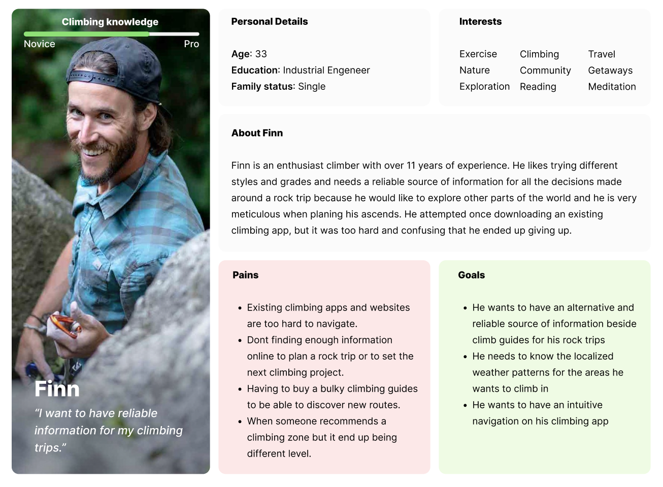
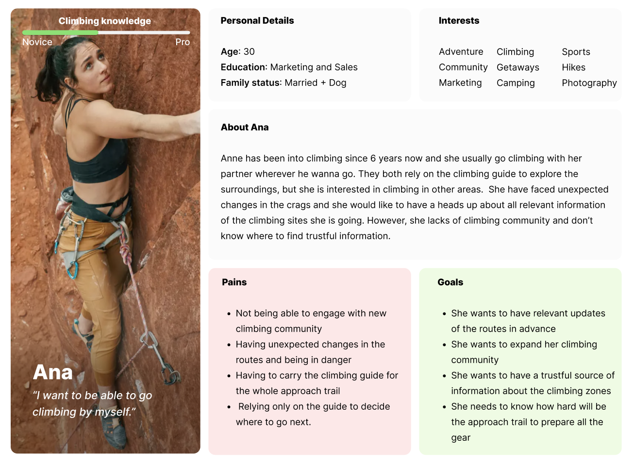
After mapping all the insights from the primary and secondary research I created two personas as a representation of the data, with the pain points and climbing goals draw directly from the interviews.
Using the personas Finn and Ana, I was able to put a human face on the problem as I began to map the user flow and create the first steps of wireframing.
THE PROBLEM
The rockclimbing community encounters difficulties connecting with other climbers and accessing dependable information about climbing areas when preparing for trips to unfamiliar destinations worldwide. Depending only on unupdated heavy guidebooks and navigating unfriendly websites has been shown to be inconvenient for climbers.
THE SOLUTION
Create an app that naturally integrates accurate route details, maps, relevant information, and community engagement features. To improve their whole climbing experience from planning, to sending the routes. Sharing their experience for future climbers and fostering connections within both new and existing climbing communities.
USER FLOW AND IA
Now it was time to think like Finn and Ana and create an Architecture of Information that could be easily digested by these two climbers.Thinking about the multiple Tasks Flow that they might ended up doing, I mapped a User Flow to have a clear interaction journey of the app.
🔎 Click the image to enlarge
Design Phase
WIREFRAMING
Let's Start Wireframing!
The third stage of the double diamond methodology started here. It was time to generate ideas by brainstorming some potential solutions. I started with a piece of paper, pens, and some markers and started to make my first wireframes. Through this process, I proposed solutions to answer the following questions:
👉🏽 What is the best way that climbers could build community and at the same time help other climbers?
👉🏽 How could users find out relevant information when preparing for a new climb trip?
👉🏽 How can climbers find new zones nearby or in a specific location?
👉🏽 How to create an easy navigation climbing app for all levels of climbers?
👉🏽 During this process, I also took into account observations and insights from user research, as well as, user pain points and desires.
👉🏽 The user flow and IA helped me to establish a sense of order when it came to how the user might navigate through the app.
LOW FIDELITY PROTOTYPE
Time to digitalize the screens
After evaluating and selecting promising ideas for further develpment, I created low-fidelity prototypes, some of which are displayed below. They pripritize layout, functionality and alignment with users’ needs, while also helping to identify and resolve design inconsistencies.
STYLE GUIDE AND UI KIT
Branding
Once the refined wireframes were prepared, and with the intention of maintaining the minimalistic and energetic vibe I envisioned for the app, I transitioned to the high-fidelity design phase. To ensure visual consistency, a simple style guide and a UI Kit were established.
For the naming, I chose "Belay Buddy" because I want this app to be like your climbing buddy, always with you and having your back. It also honors the fact that you can meet new climbing buddies on the app.
The icon is formed by a letter "B" that reflects the idea of a climbing knot, symbolizing safety and connection.
Usability Studies
HEURISTIC EVALUATION
Evaluation based on the 10 Nielsen Heuristics
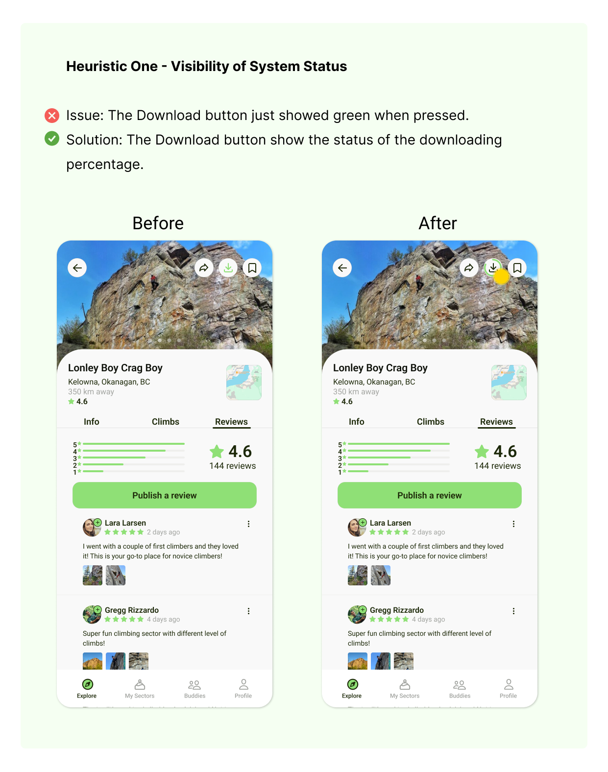
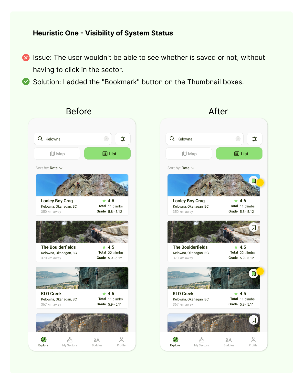
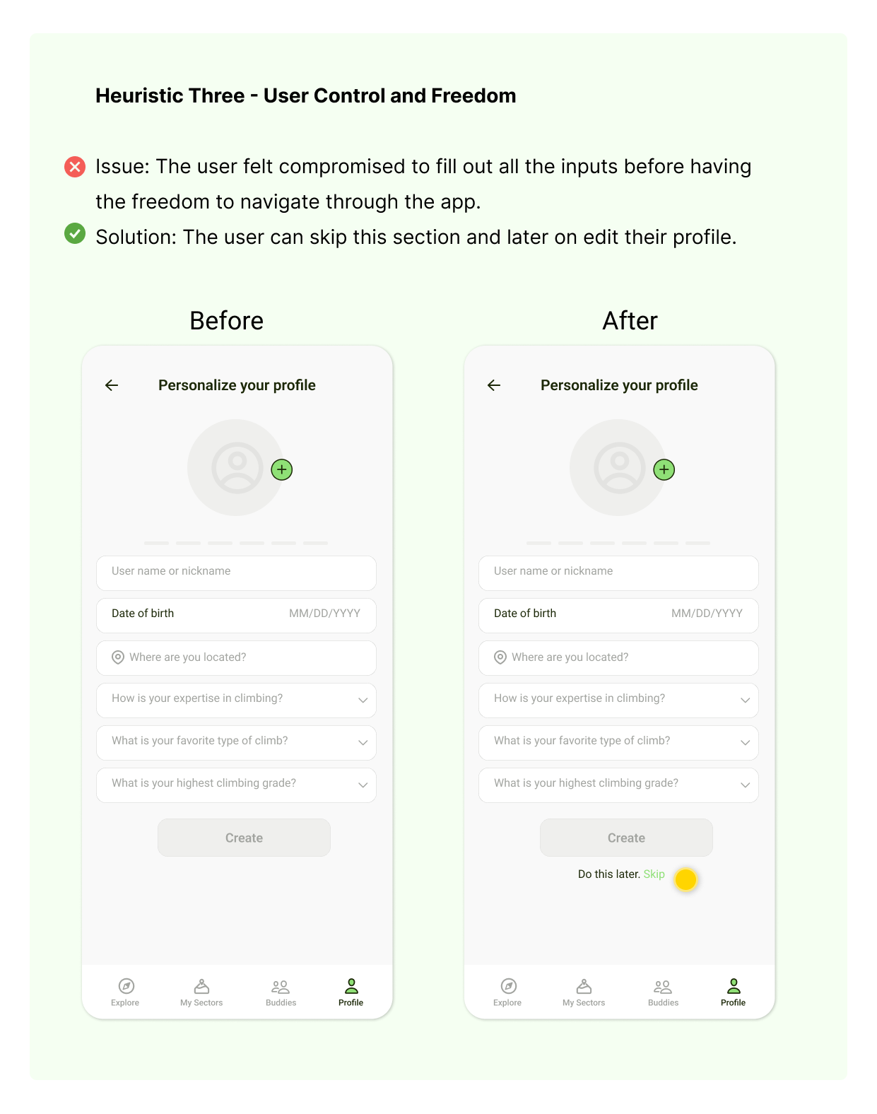
In my pursuit of enhancing the user experience of the app, I connected my high-fidelity designs into a clickable prototype using Figma, which allowed me to conduct a Heuristic Evaluation based on the 10 Nielsen Heuristics.
The main goal was to verify the smooth usability of key app features, including exploring new zones, seamless access to detailed information about the sectors, ease of saving and downloading sectors, engage with others and share reviews.
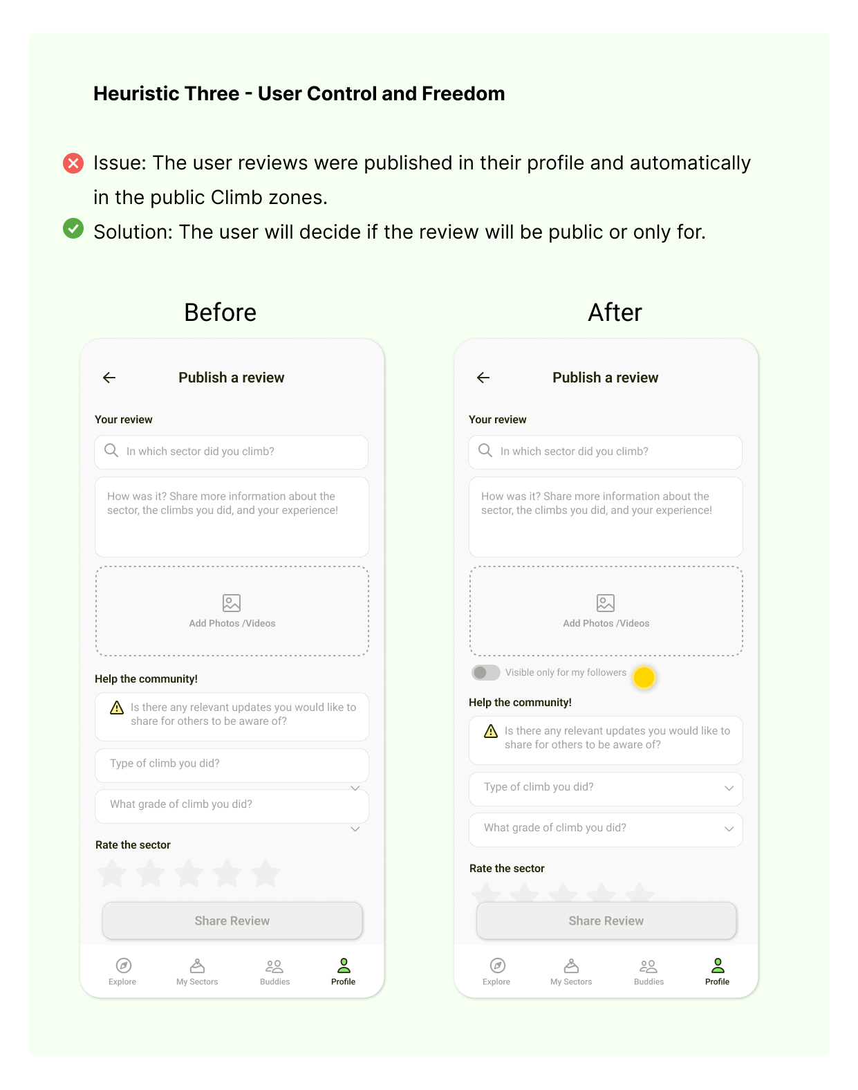
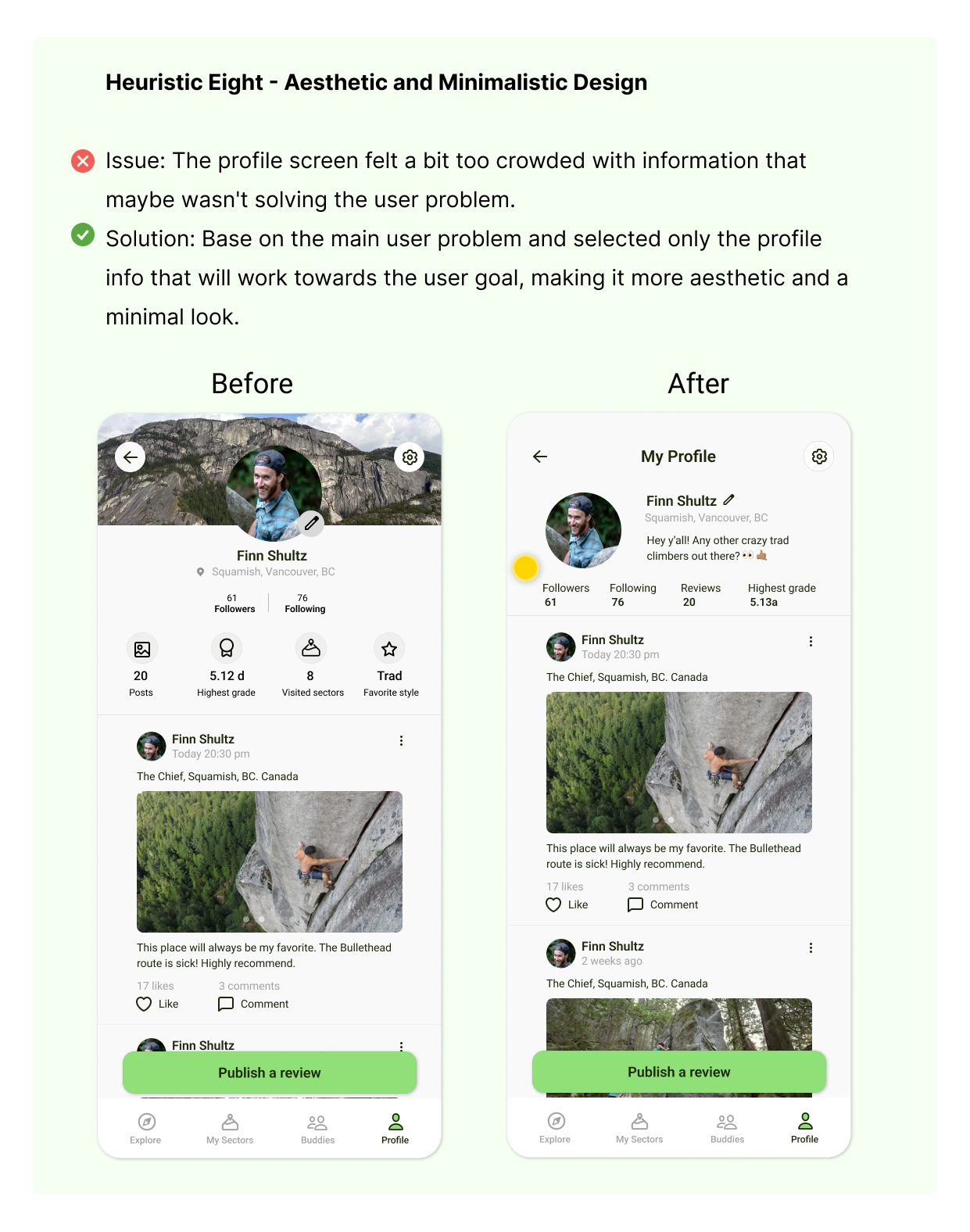
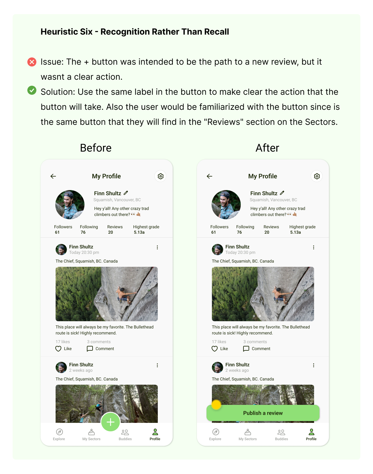
Here are the main issues that I found in the user journey, and my approach to their solution.
🔎 Click the image to enlarge
The Belay Buddy Journey
ONBOARDING
Welcome to Belay Buddy! During the onboarding process, users are introduced to the primary features of the app. This flow helps users:
✅ Familiarize with the App: Learn about the app’s main features and functionalities.
✅ Navigate the Interface: Get accustomed to the screens, buttons, colors, and overall layout.
DISCOVER NEW ZONES
Users can discover new climbing zones through a versatile exploration flow:
1. Type any location to explore specific areas.
2. Travel around an interactive map to visually explore different zones.
3. Switch between "map view" and "list view" to suit your preference.
4. Click on any sector that catches your attention to view more details.
CHECK OUT SECTOR DETAILS
Each sector details page provides users with essential information, including:
Weather Forecast: Current and upcoming weather conditions.
Important Updates: Any critical information or alerts.
Type of Rock: Information on the type of rock in the sector.
Approachability: Details on how to reach the sector.
Number of Climbs: The total number of climbing routes available.
User-Generated Content: Reviews and insights from other climbers.
SAVE FOR LATER!
Users can bookmark sectors for quick and easy access later, and also download it details for offline use, ensuring access even without a signal.
Both bookmarked and downloaded sectors are conveniently located in the "My Sectors" section for easy retrieval.
CONNECT AND ENGAGE
When moving to a new place or traveling, users often feel a lack of community, especially during rock trips. To foster a sense of community and encourage more user reviews, we’ve made the experience more interactive with interactive reviews.
✅ Interactive Reviews: User reviews also serve as profile updates. In the buddies section, users can like and comment on these "posts" (reviews), making the experience more engaging. Climbers can filter their feed by "Following" or "Local," allowing them to engage with both followed and nearby unfollowed climbers.
CHAT WITH OTHERS!
To further engage users, we’ve added a chatbox feature. Users can message their friends or new climbers directly. A red dot notification indicates when there’s a new message, ensuring users don’t miss any communications.
SHARE AND GROW THE COMMUNITY
After a climbing session, the user can share where they went and help other climbers with important updates, images and details of the sector. The user can keep the review only for its followers or for the whole community by activating or deactivating the toggle button.
Challenges and Key Learnings
DIFICULTY DEFINING PROBLEM STATEMENT
It was being challenging for me to define my problem statement, I didnt wanted to move further the Define Phase without having that accomplished. But after re-revising my research seeking for clarity, I finally ended up redefining my Problem Statement, and from there, I moved on to the next steps.
FINDING THE RIGHT BALANCE BETWEEN FIRST HAND EXPERIENCE AND RESEARCH
Since I consider myself an avid climber, I started to bias with the users' needs, however, it was a matter of revising again the research insights to get back on the right path.
DIFFICULTY WITH TIME MANAGEMENT
It’s easy to get overwhelmed when working on a UX project, especially if you’re in a 6 weeks course. It’s important to manage your time effectively and break the project down into smaller, more manageable tasks.
DEALING WITH FEEDBACK
It can be tough to accept criticism of your work. However, I learned that feedback is an important part of the design process, and it’s crucial to be open to it in order to improve and grow as a designer and as a person in general.
Despite the challenges, I was able to complete the project from start to finish. Seeing the final product come together and being able to present it to my online class, was a truly rewarding experience. I am proud of my persistence, my patience and my hard work during this course. I know there is always room for growth and I am exited of what is next to come.
